Cracker Barrel is under fire.
What did they do? They changed their logo.
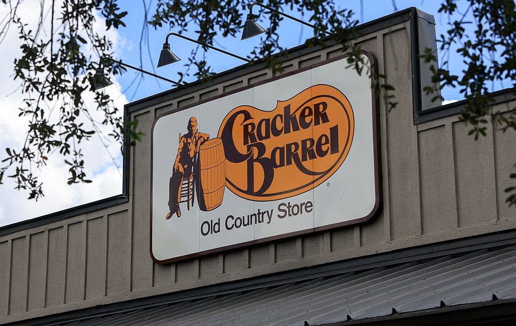
I thought their logo used to be charming. It showed a middle-aged white farmer sitting on a chair, leaning against a barrel with a logo that said “Cracker Barrel: Old Country Store.”
It didn’t look generic. Their new logo now shows the same font and letters, but they got rid of the man on the chair leaning on the barrel and the old country store. All that’s left is just the Cracker Barrel logo inside a yellow hexagonal background.
It looks like you’re driving into a Carl’s Jr.
I would hazard a guess that the shape is supposed to be in the shape of a sideways barrel, but you have to really think about it to get that far.
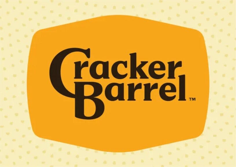
Courtesy: Cracker Barrel
It’s a very bad move.
It’s getting rid of historic intellectual property in favor of something absolutely and ridiculously generic.
When it first opened in 1969, Cracker Barrel had a logo with just text. In 1977, it updated its logo to have the man resting next to the barrel. The restaurant says the new logo is now rooted even more closely to the iconic barrel, shape, and wordmark that started it all. It also noted that farm-fresh scrambled eggs and buttermilk biscuits were the inspiration behind the color palette in the new campaign.
WATCH: The Ben Shapiro Show
Cracker Barrel CEO Julie Felss Masino tried to explain why they mutilated the logo this way, saying, “Honestly, the feedback’s been overwhelmingly positive that people like what we’re doing. I’ll give you another sound bite. I actually happened to be in Orlando last week with all of our managers. We bring them together once every other year and the number one question that I got asked was, ‘How can I get a remodel? When can I get a remodel? How do I get on the list?” Because the feedback and the buzz is so good, not only from our customers, but from our team members. They want to work in a wonderful restaurant. So we’re doing everything for our guests and our team members.”
This is very reminiscent of when we used to buy Aunt Jemima’s syrup. During the great racial reckoning of 2020, they decided they had to redo the entire logo and they changed it to Pearl Milling Company. That was bizarre, because the actual story of the woman who was Aunt Jemima is fascinating.